CONTEXT
Yellow.ai is a customer engagement platform for which it offers multiple products. From chatbot creation to agent support to marketing campaigns for your customers, Yellow.ai is a one stop solution.
'Flows' is about how users can create marketing campaigns
Led and designed entire product for MVP (2 months) and post MVP (6 months) stages
Focused extensively on user feedback while designing.
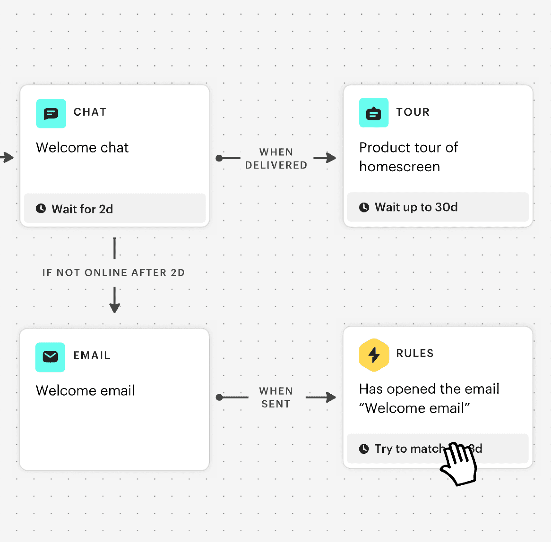
INBOUND CAMPAIGN
Communication done within app/ website to gain customer engagement
OUTBOUND CAMPAIGN
Single channel communications where a common message is sent out to a large audience
Hence, Flows got introduced!
I then, quickly started with gathering requirements from PM and insights on users, existing tools in the market since we had limited time!
The objective was majorly to understand, how the tool looked like in competitors? We observed widespread use of similar patterns and a common drag-and-drop tool.

Top competitors campaign creation tool snippets

But wait…
Why even create a new tool and not use the existing one?
Because 'Flows' has a different user persona and a totally different use case. Let's dig deeper!
USERS -

In-house within our company
Mostly our in house team helped clients onboard and create campaigns based on demand.

Marketer
Yellow's client company
We tried getting marketers feedback on tools they were already using and what they preferred,
EXISTING BUILDER PAIN POINTS -
With these insights, I moved on to ideations, userflows & solutions...
For this case study I am sharing only few of the iterations and problems,
for more in depth details happy to connect :)
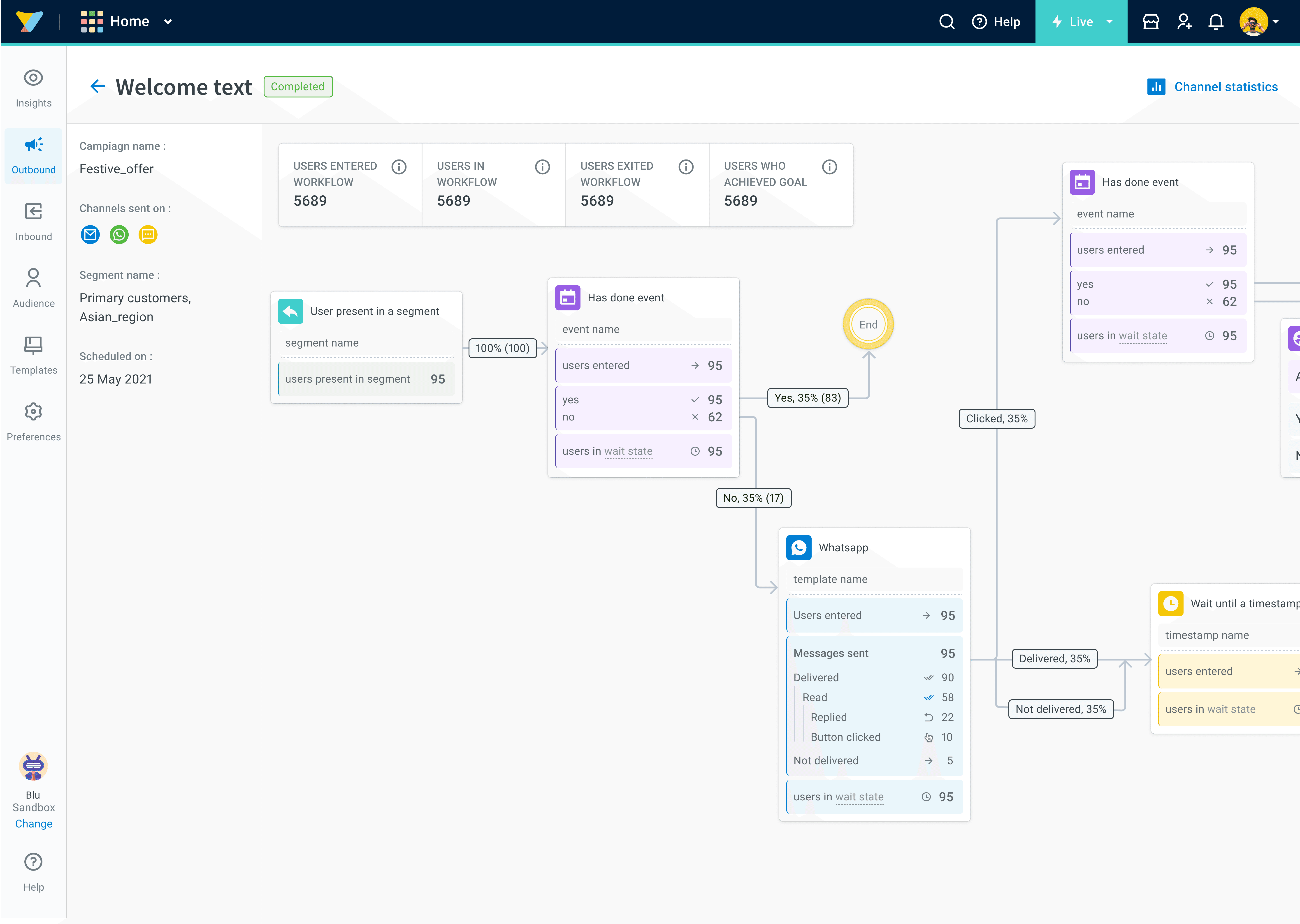
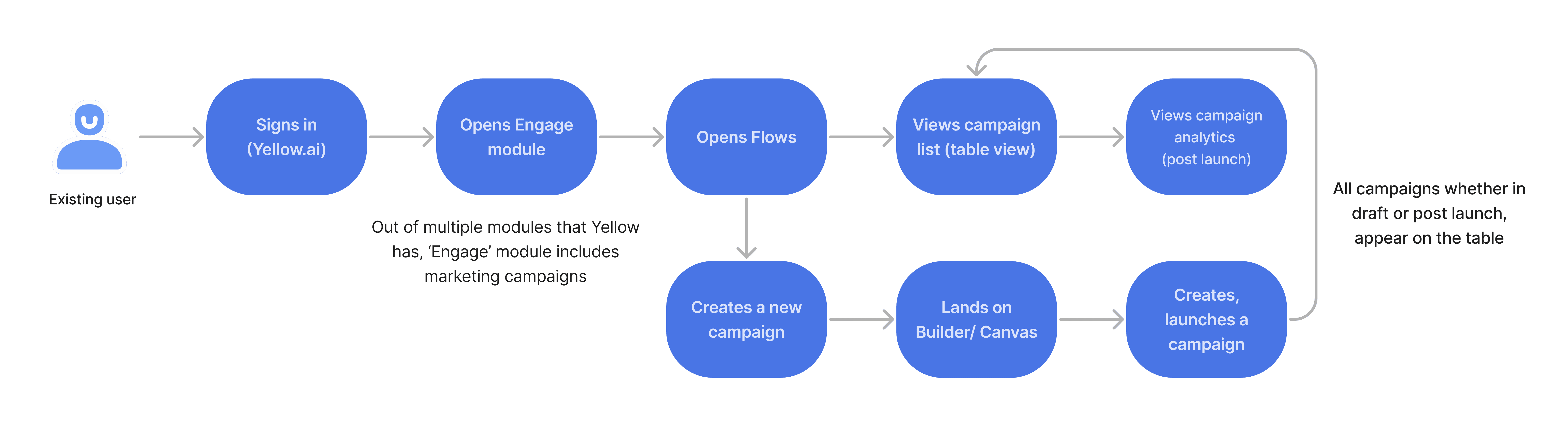
USERFLOW for 'Flows'
The userflow was a no brainer and was kept similar to the existing builder and other features.
It looks like this -
IDEATION & SOLUTIONS 🧐
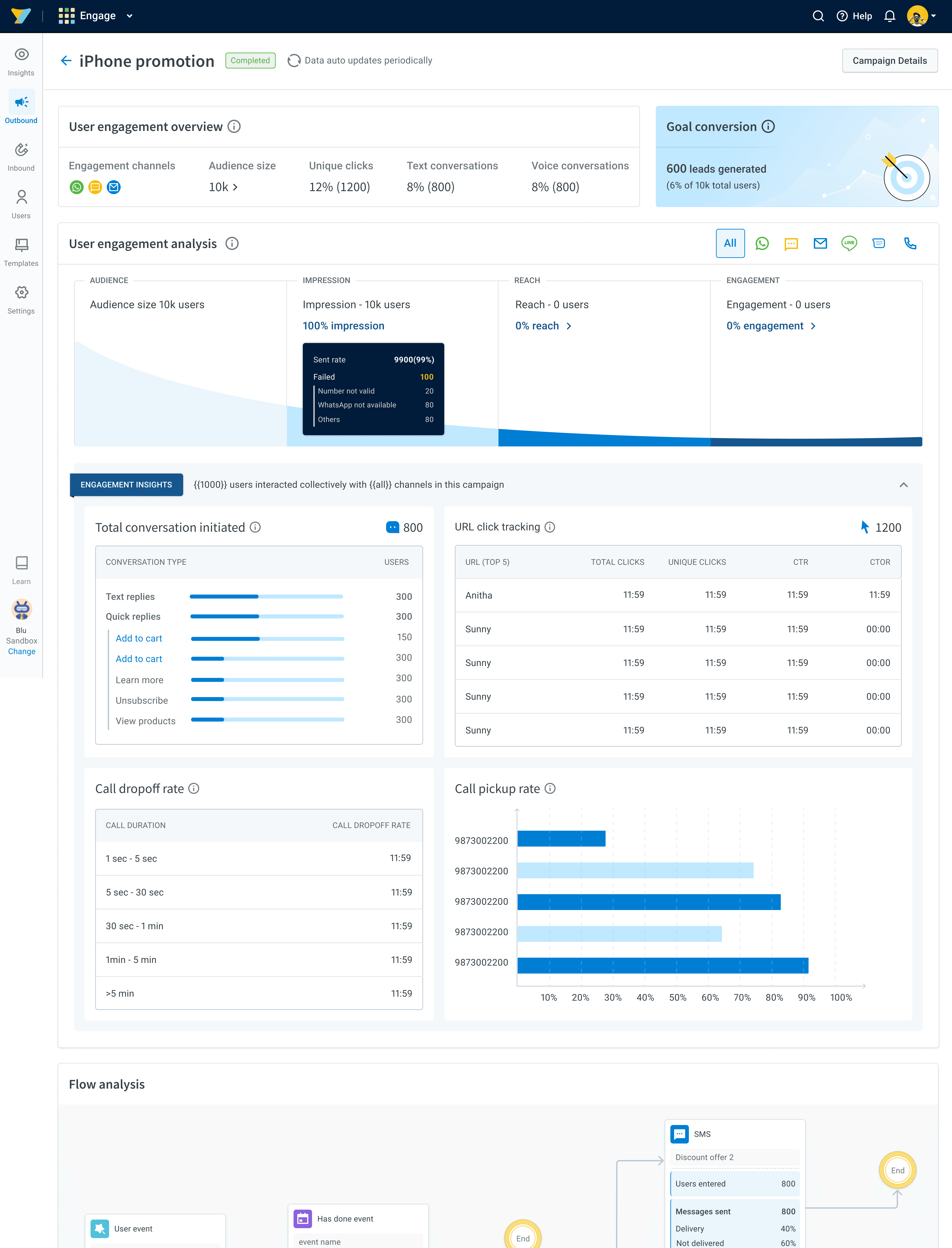
Revamped Homepage
Our product had a common empty state screen to get started with for each feature. It looked something like this -

EXISTING EMPTY STATE

Here the idea was to show information to the user through visuals since people don't tend to read data


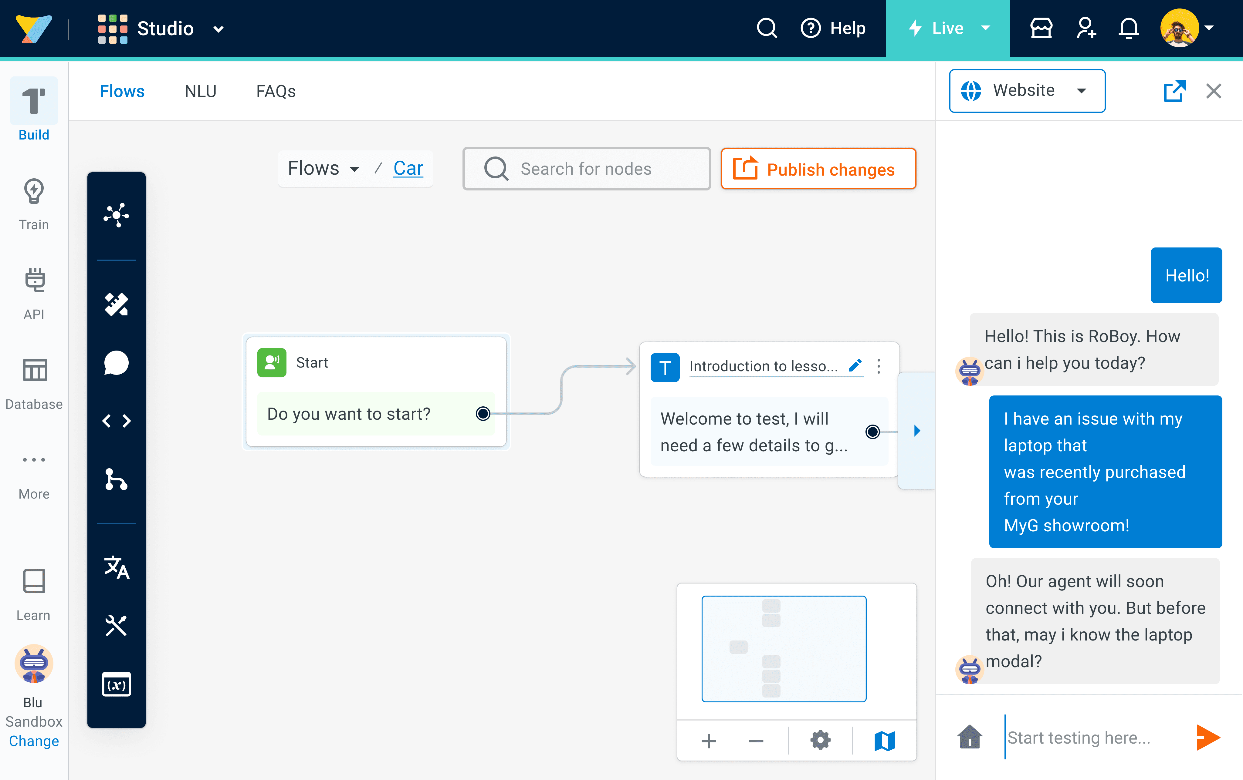
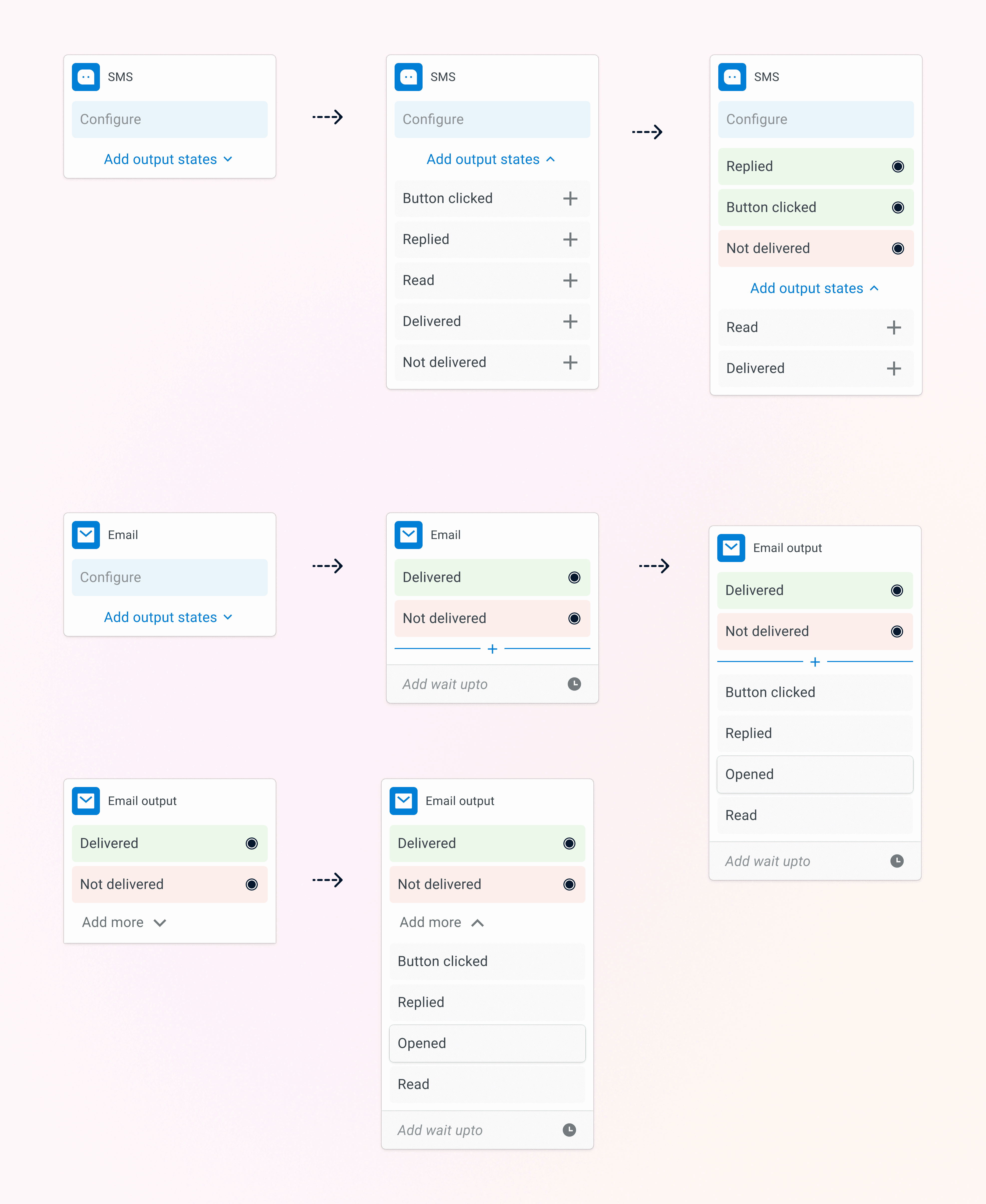
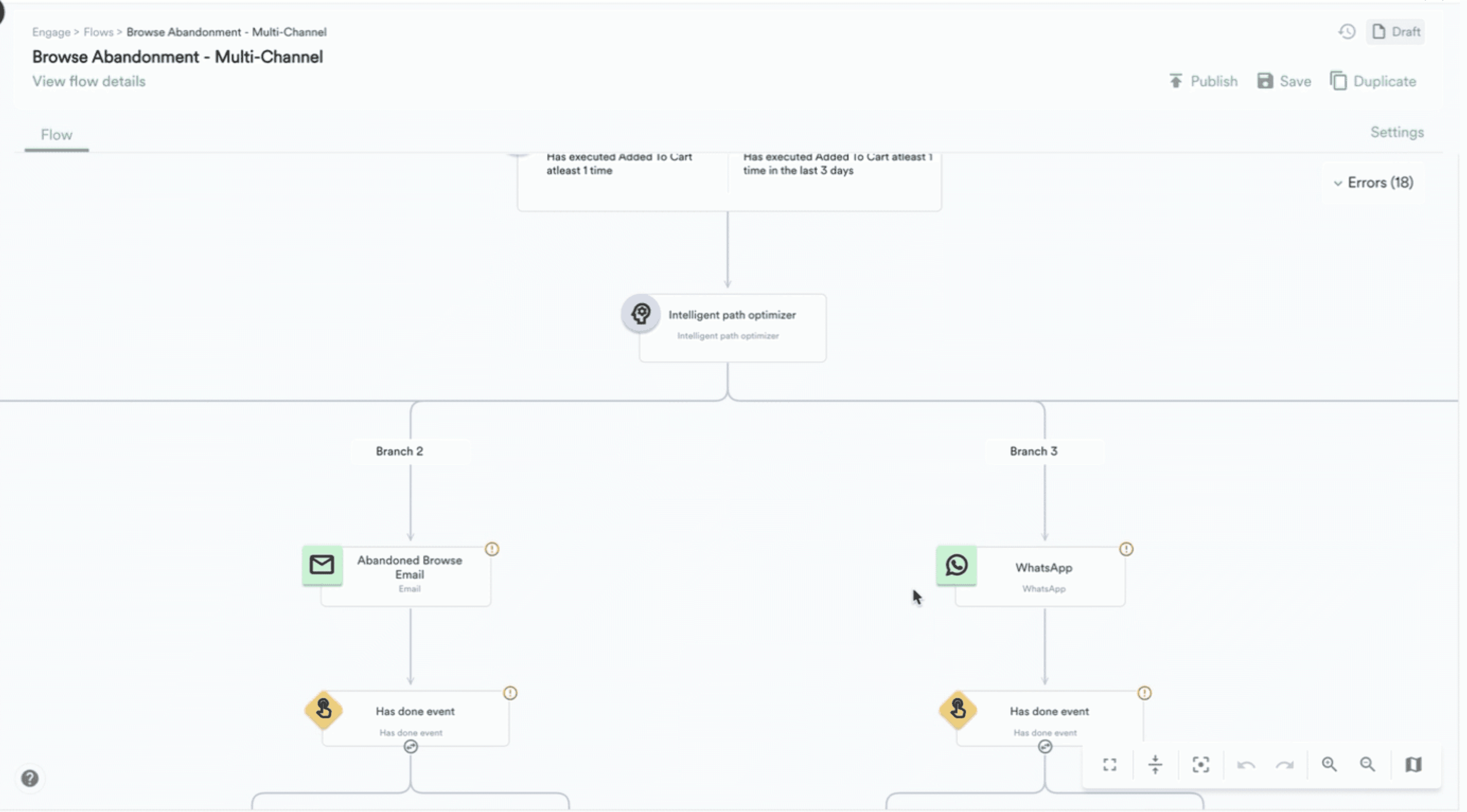
EXISTING NODES NAVIGATION

REVAMPED DESIGN
The existing node design was working well. However there were few new nodes that got introduced in Flows which required a design update.